SAUERBRUCH HUTTON ARCHITECTS

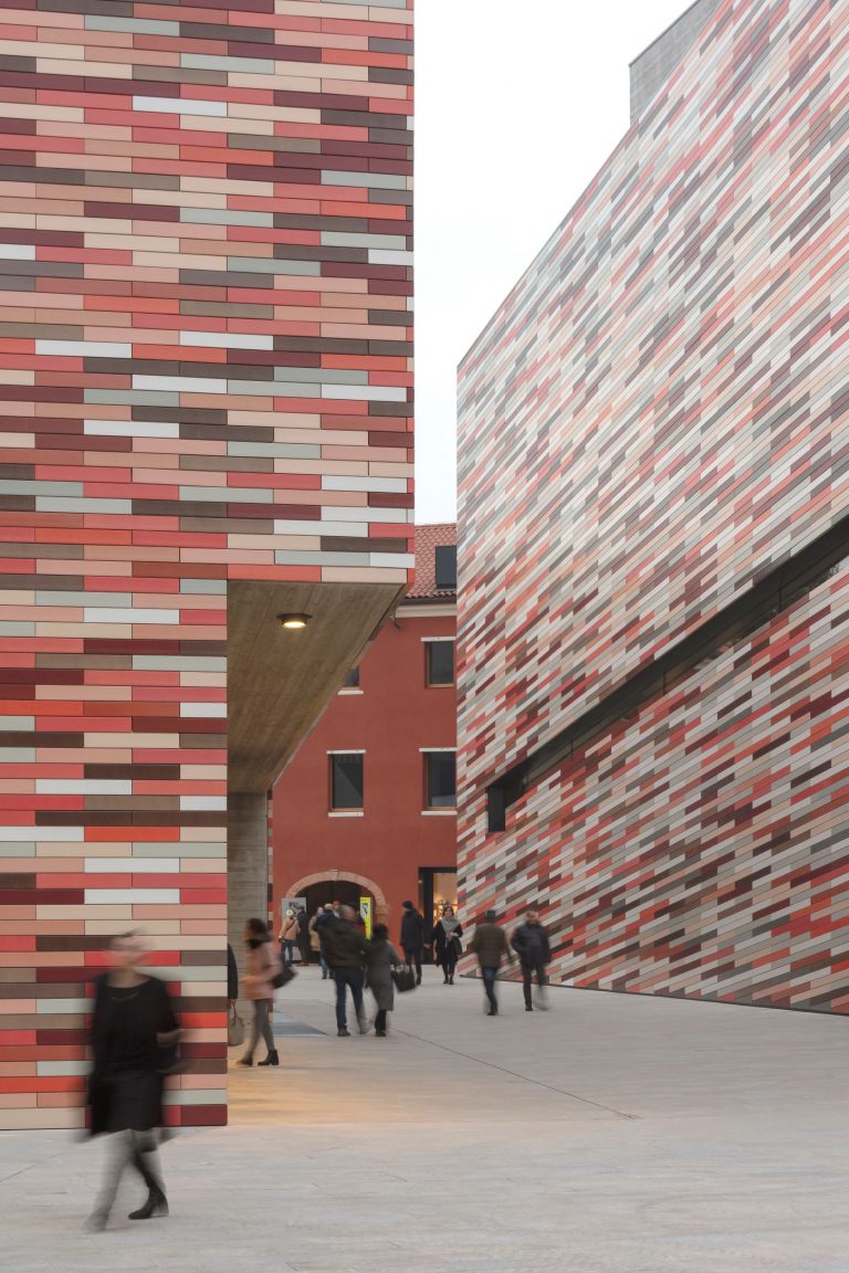
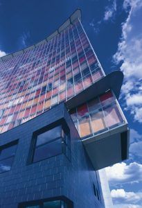
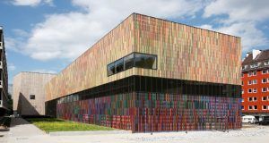
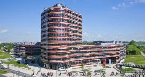
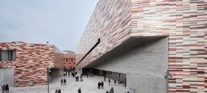
"The biggest challenge for us is always applying the desired colour to the correct material. We visited NBK on several occasions during this process. The process remained dynamic to the very end, as no single colour can be approved before the others since every colour influences the other colours in turn.
M9 Museo, Mestre, Italia

Brandhorst Museum:

It is the way in which they are combined which gives  the 23 colours that make up the Brandhorst museum their multi-faceted effect. This is complemented by the ceramic rods. They are grouped into three colour families and are located in front of a horizontally-folded metal skin, which is also painted in two colours to match the colour families. The three colour families have different tonalities and are arranged on the building in such a way that the museum appears to consist of three individual buildings interlocked with each other.
If one looks at the façade from the front, the two colours of the metal skin have a very powerful effect. Depending on the colour of the rods and the metal skin,
and the way they interact with each other, many of the colours stand out while others are absorbed by the background. The horizontal nature of the folded metal skin appears as an additional level, and is more dominant than the rods in the foreground in some cases. Thanks to its length and the fact that it is surrounded by streets, the building is normally seen anamorphically, i.e. one only sees the ceramic rods while the spaces between them “disappear” and their coloured skin appears as a solid surface. However, the rods are arranged in such a way that they create clouds in every one of the colour families, which lend depth to this “solid” surface.
Distance also plays a role. From far away, the building appears neutral because the various rods combine together to create a large mass, whose different colours merge into one neutral colour. As one moves closer, the individual layers become more and more apparent until one finally sees the depth of the ceramic glaze when standing right beside the building. This results in multiple “readings”, and as the viewer moves, the building appears to oscillate, its surface being almost dematerialised
by the colours.
The biggest challenge for us is always applying the desired colour to the correct material. Using existing samples, other colour references and product collections, we can explain our ideas to a company so that they understand our overall concept and keep it in mind. This is very important because ultimately, we are dependent on the manufacturer’s eye – whether we’re dealing with glass, ceramic or other materials.
In the case of Brandhorst, we visited NBK on several occasions during this process. Around ten to twelve gradual changes to the colour families were made. In many cases, we reinterpreted the irregularities as a different colour. The process remained dynamic to the very end, as no single colour can be approved before the others since every colour influences the other colours in turn.
Louisa Hutton

Architects projects with NBK ARCHITECTURAL TERRACOTTA

Scroll to Top